Counting Down
Within 72 hours, Canada will legalize the sale of recreational marijuana, becoming the world’s second and G7’s first country to do so.
As a stakeholder in the cannabis packaging industry, Marijuana Packaging Solution focuses on challenges this event would bring to the marijuana packaging industry.
“Try to be Non-appealing to Kids but Draw Adults’ Attention”
Designing, manufacturing, and printing packages and labels is a hugely time-consuming process. This is the reason why Health Canada published the proposed regulatory packaging and labeling requirements in advance.
As it puts, its primary purpose is to “ensure that packaging and labeling are not designed to induce young persons and others to use cannabis”.
So, here comes the vital part: how to make your marijuana packaging be non-appealing to kids but draw adults’ attention?
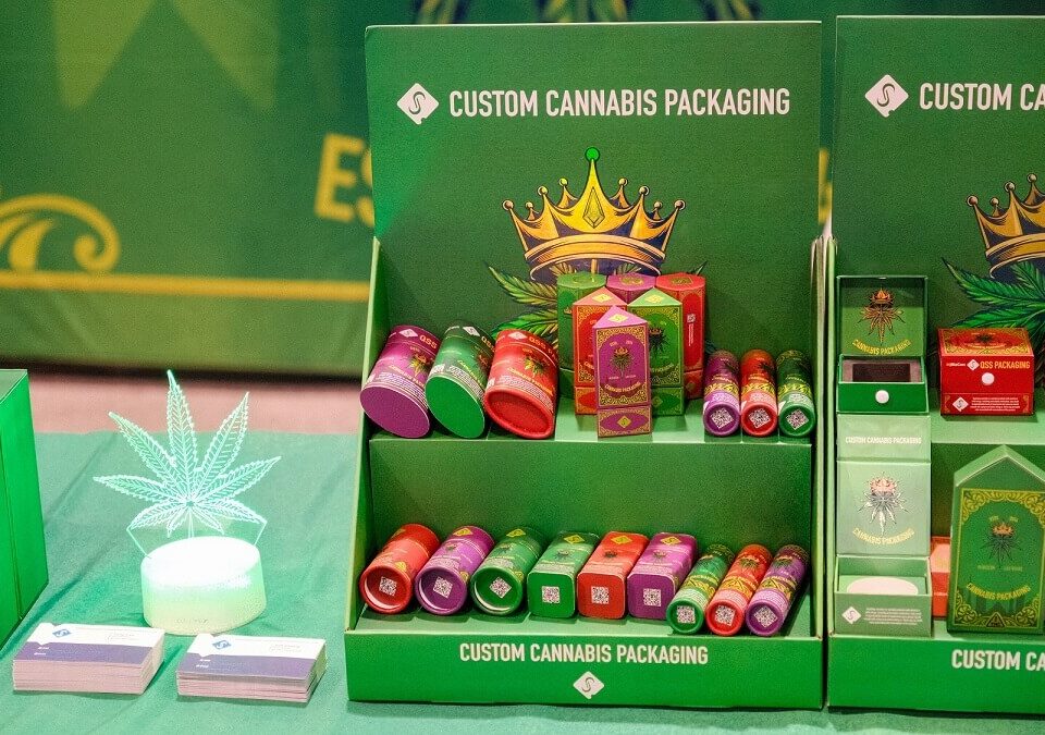
Obviously, your packaging is not supposed to be decorated with animals and clowns, children’s favorites of course. What’s more, avoid bright pinks or greens or yellows, i.e. try not be colorful on your cannabis products packaging. In a nutshell, think of those cute packaging designs attractive to kids and then avoid them.
“Plain Packaging” and “Minimalism”
“Plain Packaging” is mentioned on the proposed requirements. In other words, the use of colors and branding is restricted.
When I begin considering what “plain packaging” means for cannabis packaging industry, the term “Minimalism” pops into my mind. Simply speaking, simplicity is what it is all about.
What a great thing if we could take a minimalist approach in cannabis packaging and labeling design to be compliant with the laws and make our brands stand out.
Just take a look at some cannabis products packaging design with minimalism aesthetics to gain some inspirations.
Minimalism Designs
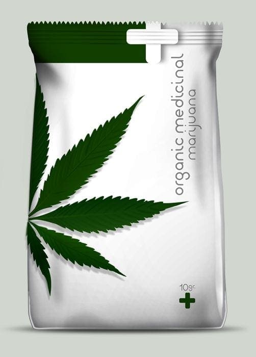
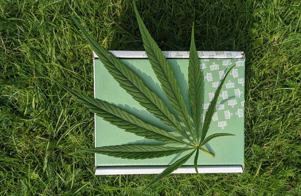
Green&White, that’s it. Clean and clear.
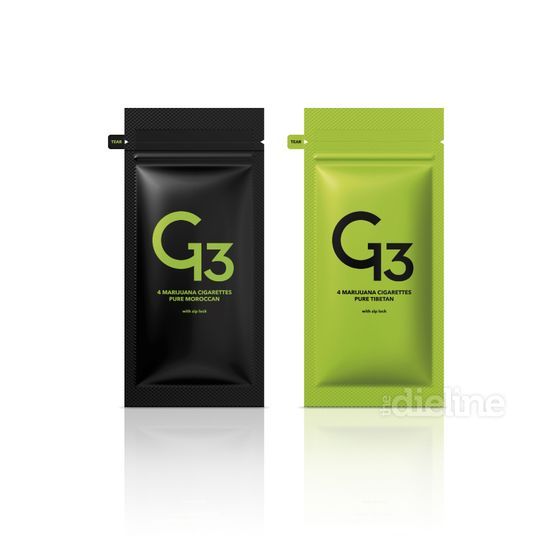
Single color to make your logo and brand stand out. No other elements to distract your customers’ attention.
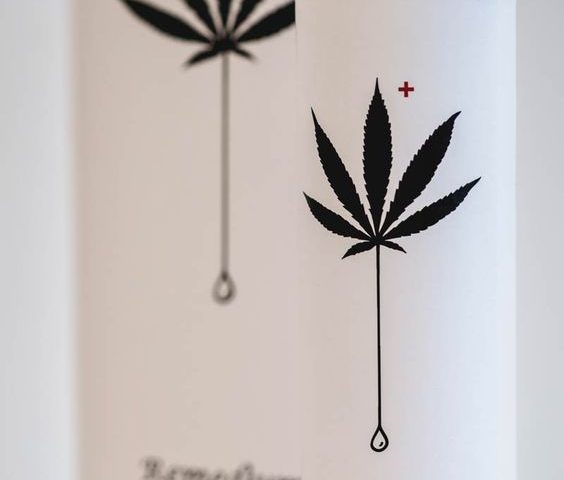
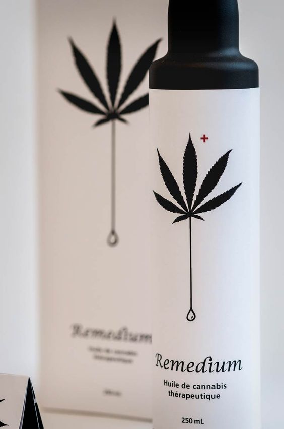
That leaf is commonly seen. But this one seems to tell a different story, right?

