Designers often face a frustrating reality: the vibrant packaging design on their computer screen does not always match the final printed product.
While calibration and ink formulation play roles, the choice of lamination—specifically the selection of a matte vs gloss finish—stands as a primary factor influencing color shift.
This guide explains the optical science behind these finishes.
By understanding how light interacts with different surfaces, brands can predict final print results and ensure their packaging communicates the intended visual identity.
The Physics of Light: Specular vs. Diffuse Reflection
To control color accuracy, one must first understand how light behaves upon striking a surface.
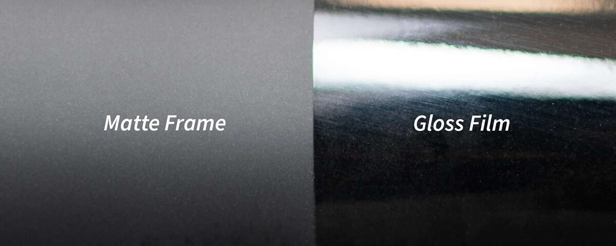
Gloss finishes create what physicists call “specular reflection.”
In this scenario, light hits the smooth surface and bounces directly back to the viewer’s eye in a concentrated beam.
This direct reflection preserves the intensity of the underlying ink, maintaining high contrast and deep saturation.
Conversely, matte finishes create “diffuse reflection.” The microscopic texture of a matte laminate scatters light in multiple directions rather than reflecting it directly back.
This scattering effect reduces glare but also softens the perceived intensity of the colors underneath.
Consequently, the same ink formulation will appear significantly different depending on whether the final coating is matte vs gloss.
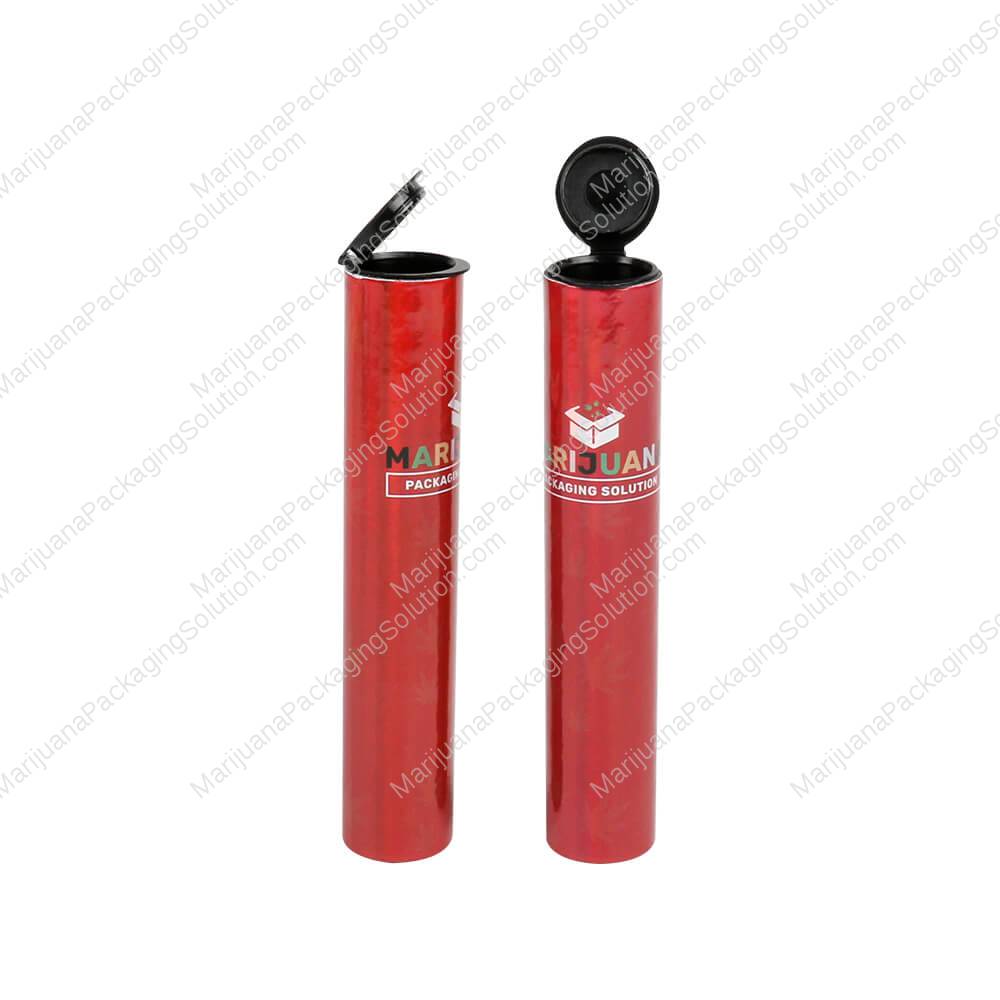
Gloss Finish: Maximizing Vibrancy and Contrast
Brands seeking maximum shelf impact often favor gloss lamination.
Because the smooth surface allows light to reflect directly, colors appear richer and more vibrant.
Cyan, magenta, and yellow inks “pop” with an energy that matte surfaces tend to mute.
This effect is similar to a developed photograph; the “wet” look of a gloss finish sharpens images and defines edges.
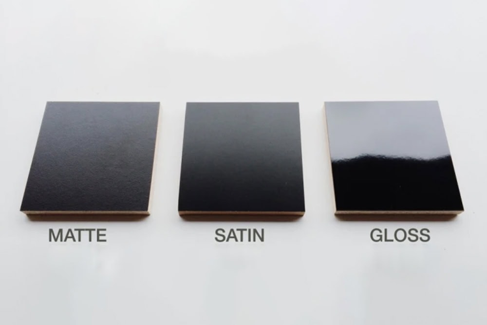
This distinction becomes most apparent in dark tones. When comparing matte black vs gloss black, the difference is striking.
Gloss black appears deep, true, and “inky,” absorbing light while reflecting highlights that define the package’s shape.
Matte black, due to light scattering, often appears as a dark charcoal gray.
Brands aiming for high-contrast, bold aesthetics generally find that a matte vs gloss finish leans heavily in favor of gloss for preserving true blacks.
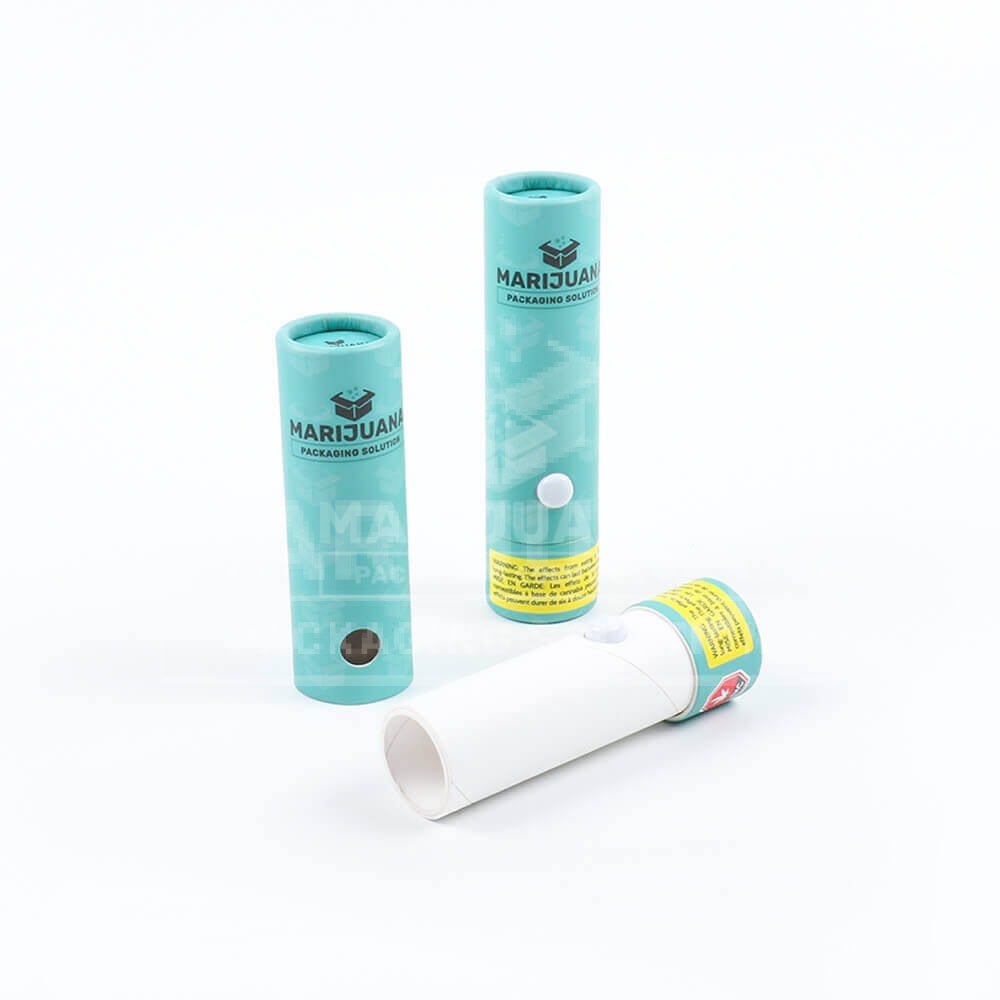
Matte Finish: Subtlety and Text Readability
While gloss amplifies color, matte lamination offers sophistication.
The scattering of light slightly desaturates hues, creating a muted, elegant palette often associated with organic or premium luxury products.
This “softening” effect can be advantageous for brands targeting a more understated demographic.
Functionally, matte surfaces excel in readability. In retail environments with harsh overhead fluorescent lighting, high-gloss packages can suffer from blinding glare that obscures text.
A matte finish absorbs this glare, ensuring that small regulatory text—such as ingredient lists or compliance warnings—remains legible from any angle.
The tactile quality of a soft-touch matte finish further enhances this perception of quality, even if the color vibrancy takes a backseat.
Finding the Middle Ground: Satin vs Matte vs Gloss
For brands that find high gloss too aggressive but matte too dull, a “semi-gloss” or satin finish offers a strategic compromise.
When analyzing satin vs matte vs gloss, the satin option sits comfortably in the middle.
It provides a slight sheen that enhances color saturation without creating the intense, mirror-like reflection of a full gloss.
Comparing matte vs semi gloss, the latter allows for better color fidelity while maintaining some of the glare reduction properties of matte.
This hybrid approach suits brands that require distinct color differentiation (e.g., flavor coding) but still desire a modern, non-plastic aesthetic.
Strategic Application for Cannabis Brands
Ultimately, the choice relies on brand alignment.
A recreational brand emphasizing energy and potency might prefer the high-impact saturation of gloss.
In contrast, a wellness or medicinal brand might prioritize the calm, trustworthy aesthetic of matte.
Designers must anticipate these shifts. If you select a matte finish, we recommend slightly boosting the saturation levels in your digital artwork file.
This adjustment compensates for the natural dulling effect of the laminate, bringing the final printed result closer to your original vision.
Whether you choose matte vs gloss, understanding the physics allows you to manipulate the design for the best possible outcome.
The decision between matte vs gloss involves more than just texture preference; it is a critical component of color management.
The finish you choose will fundamentally alter how customers perceive your brand’s palette.
We encourage all clients to request physical proofs before committing to a full production run.
Seeing the actual interaction between ink and lamination ensures no surprises on delivery day.
Contact our packaging team today to discuss which finish will best elevate your next product line.

